About This Project
T.A.B
Team project for Interaction Design Practice
Fall 2015
PROBLEM
In this project, we tackled the problem of organizing shopping experiences. This includes making it easier for shoppers to locate deals near them, creating a simple and organized space to store the user’s rewards card information, helping shoppers to be able to plan what stores to go to ahead of time so that they don’t have to waste time walking through multiple stores to find an item, and in general taking unneeded stress out of shopping. Ultimately, the goal is to help users to save money by streamlining their shopping experiences and helping them to achieve their savings goals, all from one convenient location.
Our observations and interviews indicated us, that when people are buying have to face the following problems:
- People want to save time
- People want to save money
- People want to find the right thing easily
THE SOLUTION
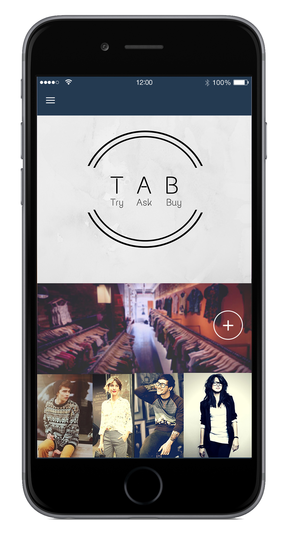
T.A.B. a mobile application which helps users to shop easily and conveniently from home or away. Our application can be split into three modules namely:
- TRY
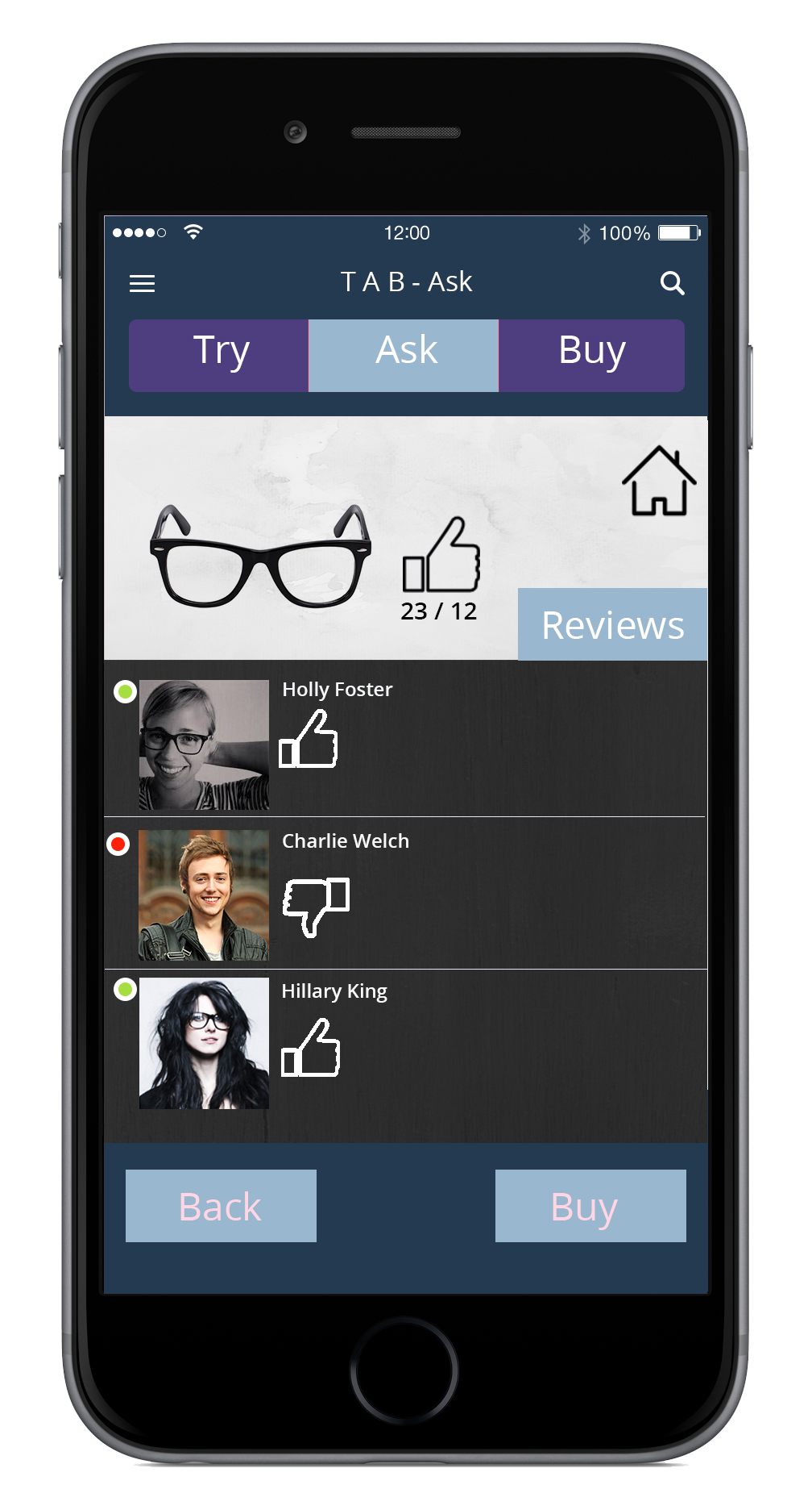
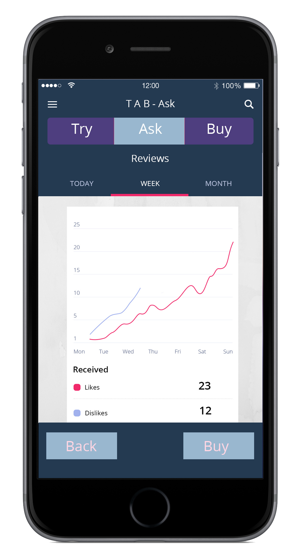
- ASK
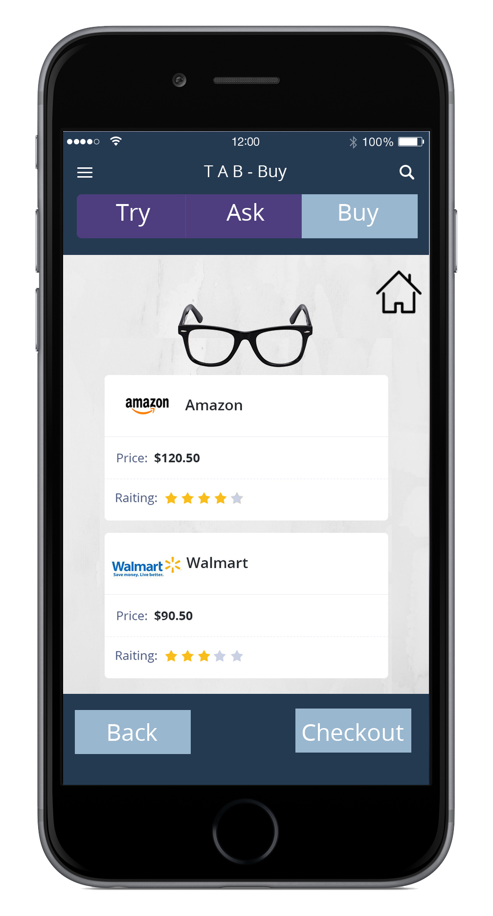
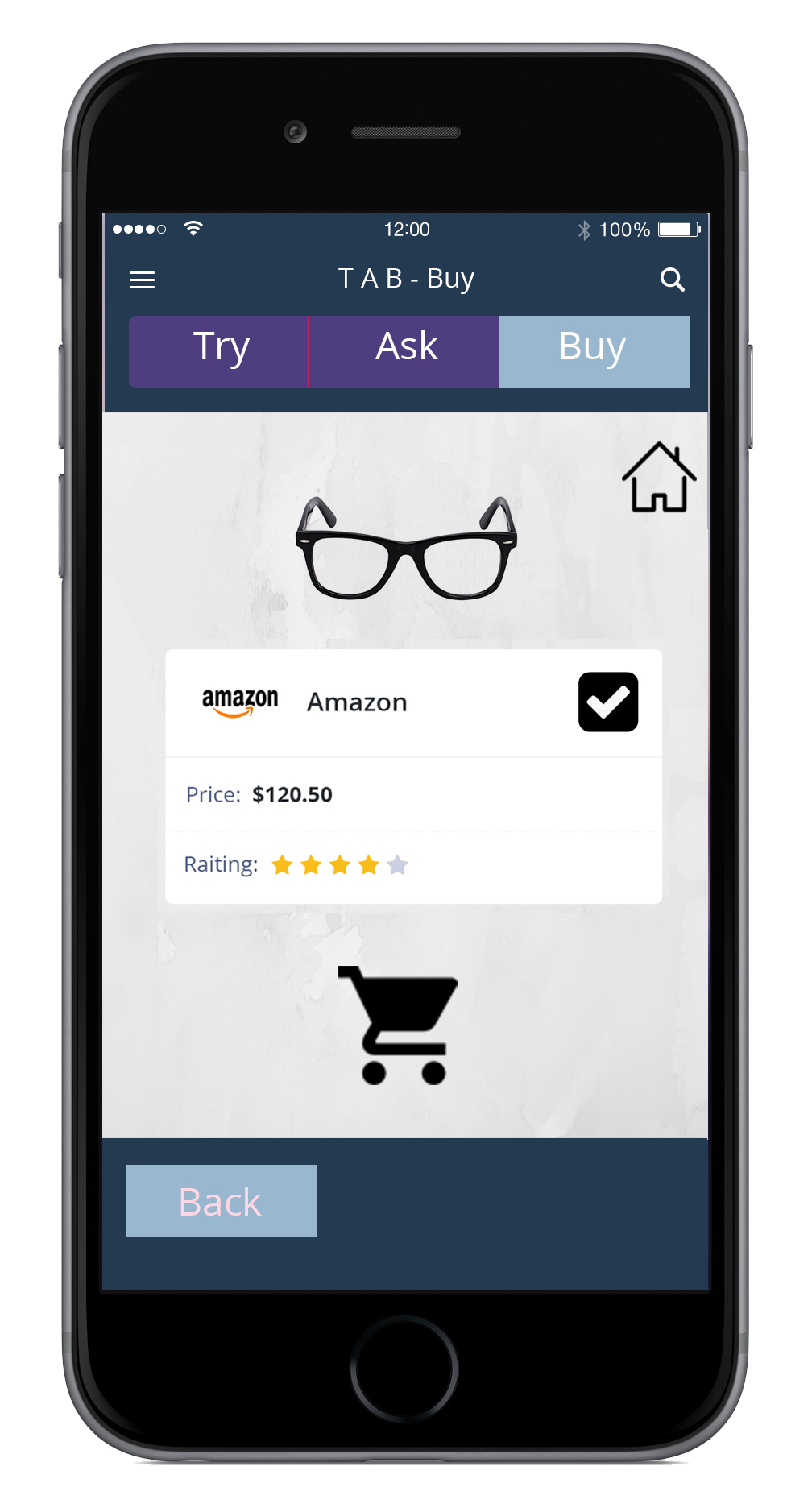
- BUY
All modules can be accessed directly or in sequence and they are independent of each other.
PROCESS

OBSERVATIONS
Visiting different stores reveals that the experience of shopping varies in relation with the intended purchase, the desire to obtain the product and having a companion or not while doing the shopping.
From observations, we learned that stores like Walgreens and CVS Pharmacy provide an experience does not take up much of the customer’s time when shopping for their products. The majority of people who visited these stores did not hesitate for a long time as to where to go or at least, they easily found the location of the aisle they needed. In contrast, in places like Kroger people were willing to spend more time comparing products in order to get what they wanted. In relation with the comparison, it was observed that people in wheelchairs and seniors, who were alone in the stores, not only struggle to get their products but they also spent more time deciding on each product and trying to figure out which aisle to go to next.
In the case of apparel stores, clients were likely to invest more time when making their final decision of what to buy. But this decision is also affected by the fact that do they have a companion or not while shopping. In this sense, I would like to quote an employee of GAP who said: “women that shop alone usually spent more time deciding on their clothes. In contrast, women that came to the store with someone else decided faster”.
Probably, this is related with the fact that having a second opinion helps us to make a faster decision. Therefore, there is a correlation between the necessity and interest that people have in obtaining a particular product and the time they spent in shopping for it. On the other hand, something that I noted while observing is that people repeated paths, like visiting the same aisle or corridors twice. This was particularly obvious in Kroger.

INTERVIEWS
Collection of interview questions from each team member.
- Why do you like to come to this store?
- How do you usually carry all your food?
- Is there any reason, you prefer to walk instead of using the electric wheelchair? *Just for the seniors
- How many times per week do you visit the store?
- Do you always come alone?
- Have you checked for any other method to get your groceries, like home delivery
- Can you describe a normal day at the mall when you wish to purchase something?
- Do you generally know what to buy or are you here to look around and then decide?
- What are you here to buy today?
- Could you tell me how you find shops from which you want to make a purchase?
- How do you think technology can help better your experience while you are at the mall or store?
- What kind of information would help you decide on whether or not you should go shopping today?
- What is one app your smartphone can have that would make it easier for you to find and buy something here today?
- How do you go about looking for something specific online?

DIAGRAMMING & PERSONAS
Affinity diagram
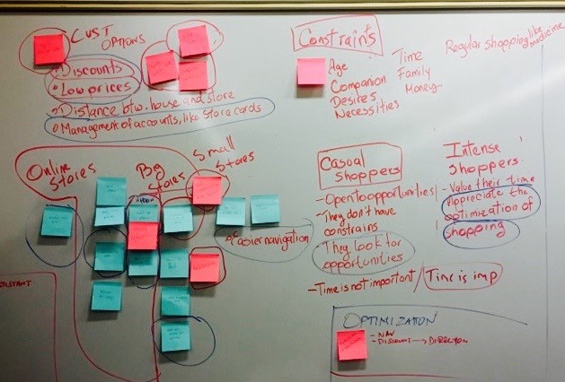
Affinity Diagramming helped collate all our findings and synthesize our understanding of each other’s observations. It helped us identify different but similar problems that users face in their approach to shopping. We were able to find problem spaces that overlap each other.

Empathy Map
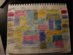
The Empathy Map helped us understand what the users were thinking when going through the shopping experience. It helped us identify user goals and needs and differentiated pain points, which can be resolved, and difficulties that need further observation. It greatly helped us narrow down problems faced by the user and, in turn, understand the frustration associated with it. It also helped us simplify our original Observation and Interview report thereby highlighting the exact problems we can proceed to help resolve.

Personas
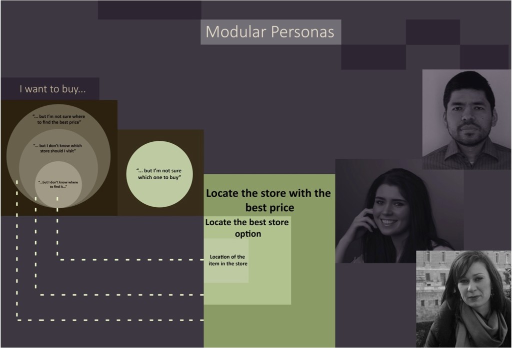
We generate our Modular Persona, based on the Modular Persona of bolt | peters.
Here a description of our process of creation:
- Data Collection Stage: To generate our Modular Personas, we first prepared our findings, by identifying the desires and necessities of the users. To do this, we used the Empathy Diagram and our field notes.
- Synthesis Stage: Then, we recapitulated on the different problems and necessities that we recognized in the users, while the observations. To do this, we defined dimensions.
- First dimension: we identified the frequency of shopping of our users.
- Second dimension: we identified the motivation of users, the why?As a result of this process, we identified four types or users, and we wrote, in brief, sentences the needs and possible solutions for each type of user. Then, we found that three of our Personas have the necessity to “find”, but the context of each of them was quite different. We explain this in more detail in the next section. In the end, we had the different personas, and also we identify possible solutions. To communicate our findings appropriately we designed the following illustration:

BRAINSTORMING REFLECTION
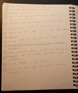
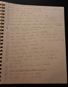
In our first brainstorming session, it was easier to identify ideas as we were brainstorming for the user space rather than user needs. Our Second Brainstorming session was more productive as we were grounded in user needs/requirements, which took a longer time to identify ideas, but helped us empathize more closely with the user. Our second brainstorming also helped us identify ways we can improve the Shopping experience for disabled people with accessibility problems, which was something we had missed in the first session brainstorming.
DESIGN ALTERNATIVES
These alternatives resulted from brainstorming sessions and group discussions we had. In this respect, we first generate ideas that were simple and then our ideas evolved and got more sophisticated and finally formed into complete ideas. On the other hand, we also had to make design decisions and dismiss several ideas and decide which could be the only three design alternatives.
- Save Money & Time
We considered to implement a system that lets users trial items such as sunglasses and dresses online using stock photos so they can save time. We would also like to collate all of the customers reward points to existing discounts at shops to provide customers with the best price option. A compare option across multiple stores can also be provided. Shopkeepers can be provided with beacons that help them know when a customer is nearby and send targeted discounts for a more personal shopping experience and better price tag.
- Buy the right product with no “Buyers remorse”
For this problem, we though building a social media or artificial intelligence-driven system that provides valuable feedback to customers at the time of purchase. It provides help to the user when making the decision to buy a product so there is no “buyers remorse” in the end.
- Navigate easily
Using interactive technology either in the customer’s device or in the shopping location we could provide users with navigational paths and best routes to traverse the labyrinth of shops available to them. We could also provide wireless charging on customer cars to ensure a seamless experience. Kiosks that guide the user to item location if made available will simplify some path reversal that all customers eventually end up going through.

DESIGN SOLUTION CHOICE
Our previous design solutions are mainly related with three issues: Navigation, Buying the best item and Save money and time.
For our final design solution, we decided to combine solutions that solve all the three issues previously mentioned. Therefore, we will design a system composed by:
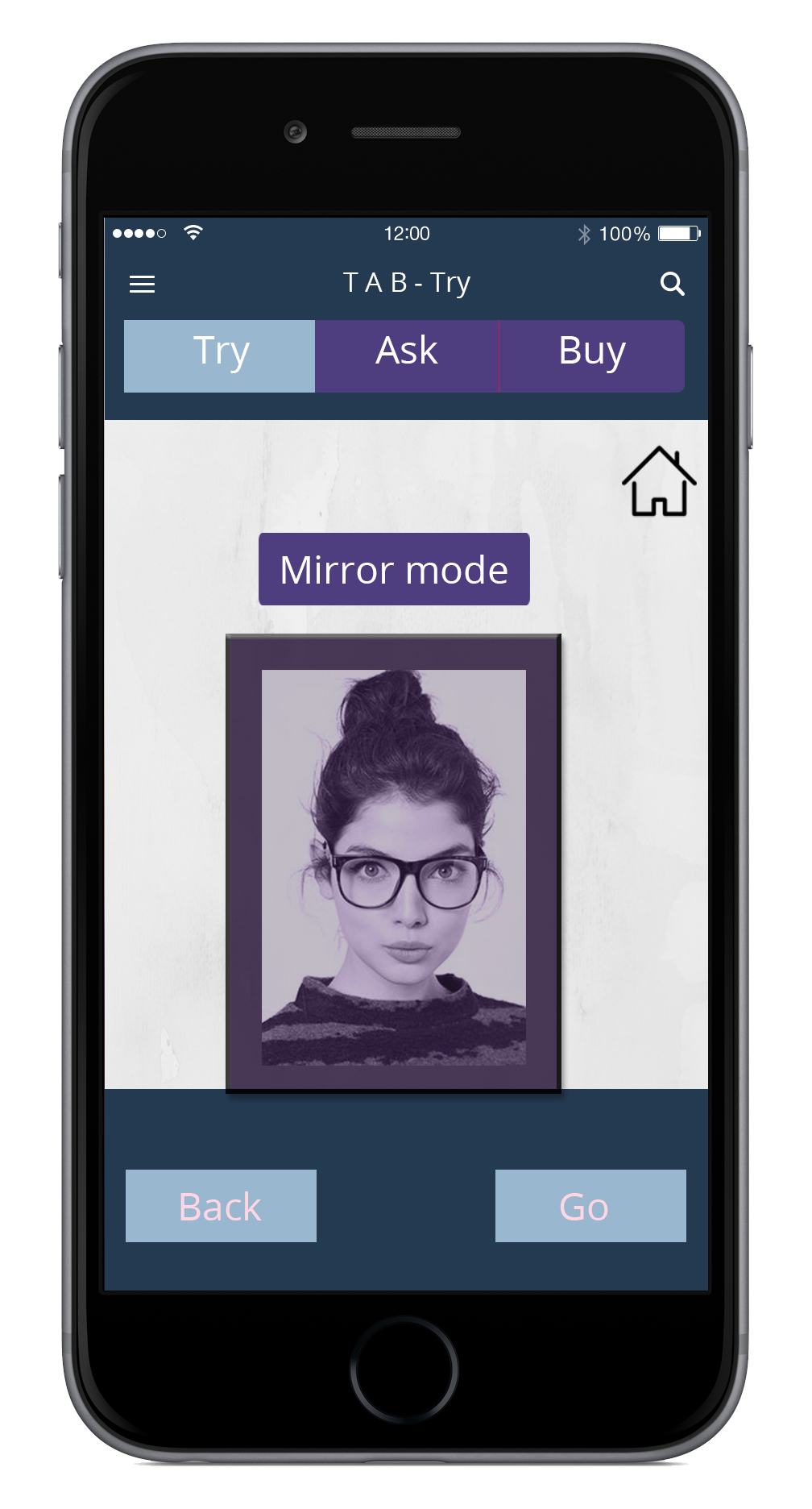
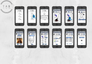
- An application (mobile and website), which would allow our user to try different items virtually at their convenience from their homes, by having them superimposed on user’s picture. Examples may include glasses, a haircut, new tie or a customized cap.
- This system could also allow users to take pictures of themselves when in-store and send those pictures to family and friends to get quick feedback or a relevant suggestion, which would facilitate the decision to buy or not buy an item. Additionally, if the user does not wish to let others know about their purchase as it so happens we can use AI driven feedback. Such a system will provide information about others who made the purchase along with how it looked on them and their level of satisfaction with that particular product. Imagine Yelp for clothes rather than stores.
- Finally, in order to truly help the customer make the right choice we would like to link their reward and discounts to store offers and loyalty points. This would help them buy the best item available to them, at the best rate from a shop that provides the most choices.
We decided on this design, as we wanted our application to be user-centric and provide customers with an all-round solution that them the experience shopping in a simple yet effective way. By designing this system, we expected to enhance the user’s experience while shopping and help them to identify the best option to buy by facilitating their decision-making process.
PROTOTYPE
SECOND ITERATION
SKILLS EMPLOYED
Ideation, In-depth interviews, Data analysis, Usability Testing, Visual Design, Interaction Design
Date
Fall 2015
